
- Are you confident that you are presenting financial data effectively?
- Are the exceptions and significant changes over time in your financial data obvious at just a glance?
- Does your reporting provide motivation for your leaders to dig deeper, and drive their organization to the next level?
Even the most basic financial platforms accumulate massive amounts of data and all platforms provide some standard reports and charts. Dashboards are also common and often are included in every organization’s technology stack. Organizations with a rich technology stack also find that the data can really tally up.
But do these standard reporting options and dashboards tell your organization’s story? Or have you fallen into the practice of watching the same KPIs, month after month? What are you missing? What needs emphasis?
Nearly every organization will benefit from visuals that complement the built-in tabular and summary reporting, and visual tools can effectively highlight both patterns and exceptions, leading to insights and actionable ideas that benefit the organization.
Earlier in my career, I had the opportunity to work with apparel designers on a material sourcing project. As they designed each new apparel product, the team had a practice of capturing material-related data (such as the length of a zipper or the amount of fabric needed) along with a sketch of the finished garment in Adobe Illustrator. All of the information was stored in the Illustrator file.
This made a lot of sense as the new product was taking shape, but presented challenges when the project was approved and it was time to create the cost projections, calculate minimum order quantities, and prepare purchase orders.
The material and purchasing data needed to be captured in a spreadsheet, and I created a simple solution to facilitate this task. When I sat with the designers to demonstrate the process, they audibly groaned at the sight of a spreadsheet. Watching their reactions, (one person winched and shielded her eyes) I had an Ah-ha Moment that forever changed my approach to presenting financial data: If the data can’t be seen by the users, it cannot be effective.
Finance professionals are trained to discover insights from “just the numbers” and, for that reason, we often present data in a table format.

We often explain this data by walking through the month-over-month, year-over-year, and year-to-date comparisons.
In fact, the SEC requires exactly this sort of presentation and analysis in financial filings for public companies, and nearly everyone working on Wall Street is comfortable with the format – it is their default. My experience working with creative designers taught me that I needed to incorporate visuals into presentations of data. Simply put, the table format is not their default.
As I started to create more visuals, I realized that I was viewing each client’s data in new ways. I started to spot trends that piqued my curiosity, and more importantly, theirs.
Does the standard, dry numbers-only tabular presentation work best for all audiences? Not when leadership teams, the board of directors, and potential investors are all made up of people who bring a wide and diverse set of skills to your organization.
And even if your audience is made up of financial professionals, attention spans are short, there are many demands for their time, and they are best served by seeing your most relevant insights concisely and succinctly.
Even better if the insight, whether a repeating pattern or a one-off exception, can be grasped by your audience without your verbal explanation. Let the data speak for itself!
One Example
Imagine that your organization needs to address increasing pressure from rising inflation. Your team needs to focus limited resources on the strategy that has the best chance of increasing profitability or driving sales higher. In this case, the organization is made up of two companies: Company A and Company B.
Both companies sell the same products. Company A uses a retail model and Company B provides subscription and delivery services. This is a common scenario, especially as traditional product companies experiment with new sales channels.
You decide to dig into your data and visualize results from a variety of perspectives. One of your visuals shows that Company B is achieving better results and you want to share your findings with the leadership team.
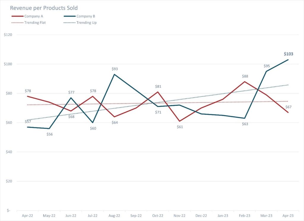
From this visual, your audience can quickly understand that they are seeing revenue per products sold for each company and that results for Company A are trending flat while Company B is showing an upward trend.
Additionally, this chart can stimulate curiosity about the inverse relationship between the results for the two companies. Ideally, discussion is sparked among the leaders about potential causes driving this pattern and possible reassignments of resources to Company B. This visual will help you achieve that goal.
And notice that I’ve reduced excess noise in the chart by eliminating some of the data labels. This helps the audience focus on the more important points, essentially taking them where I want them to go. In fact, the trendline for Company B pulls the eye up and directly to the desired result of $103 revenue per product sold. Bam!
Best Practices
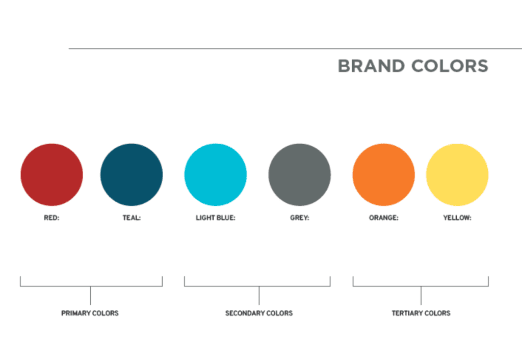
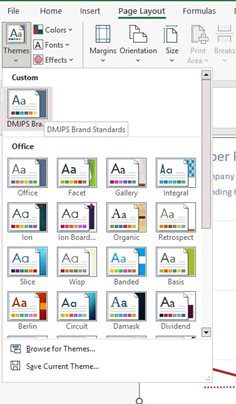
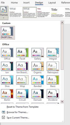
To bring more interest to my chart, I’ve incorporated my firm’s brand standards into the design. I recommend creating custom themes for spreadsheets and documents using your organizations brand colors and fonts.
In Excel and Word, you can create custom themes once, make these your default, and take your visuals to the next level with very little effort. To do this, visit Page Layout in Excel and Design in Word. In each application, choose the colors and fonts of your brand standards, and then save the theme as your default.
Excel | Page Layout Word | Design
Conclusion
Your organization’s data can do more than sit passively in tabular form; visual reporting can be used to help your leaders understand what deserves their attention, both for addressing problems and also for emphasizing successes.
I can help you visualize your data. Contact me and let’s start the conversation about putting your data to work for you to improve analysis and engagement with your audience.

Jennifer Caldwell-Billstrom, CPA
Jennifer Billstrom is the Director of the DMJPS Client Accounting & Advisory (CAAS) team. In her role as Fractional CFO, she supports clients in performing essential financial analysis through a variety of accounting and advisory services including supply chain planning, production planning, and fulfillment prediction. Jennifer is an expert user of Excel and enjoys using Power Query and Power BI to facilitate data analysis.